Monday, 23 February 2015

How my cover links to the research

This is my final cover page, making this took the longest for me as the positing of text and graphics didn't seem to work well. In regards to my research I followed through with what my target audience suggested in terms of colour schemes and subtitles related to the topic of gossip. I also made the price range within £2 as suggested by my target audience.

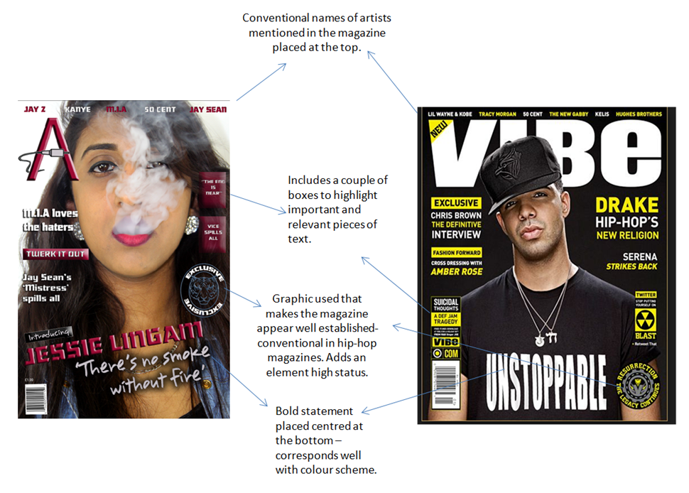
In terms of following conventions of hip-hop magazines, I used this magazine as a guideline.
Here are some conventions I followed to achieve clarity in the genre choice of hip-hop.

Monday, 9 February 2015

Changes so far

Since my last blog post, I have decided to make many changes to the layout and picture.


 I have completely changed the image i used for my cover as I think this new image on the right is much more conventional for a Hip-Hop magazine . I think that the new image has a much better colour scheme which uses colours which contrast better and apply to conventions. 

I changed my tagline to better suit my image and the font used for it works very well with the theme of the magazine. 

I also changed the positioning of some text from my new magazine cover recently so it worked better with conventions of hip-hop magazines, I got this idea from "VIBE" magazine and I thought it worked very well and looked clear.

Friday, 6 February 2015

Making my masthead

This image shows the changes I have changed to my Masthead since my last blog-post.


Wednesday, 4 February 2015

Artist worthy of features?

Powered by emaze
This "emaze" presentation highlights features that I will potentially use within my cover page. I looked at both market and audience research to understand what type of features work the best on a hip-hop cover page.

Cover layout decisions so far


In regards to the positioning of the text on my front cover, I have chosen to now place names of artist at the top of my magazine cover and i smaller font. This will enable me to place more information on my magazine without it looking too over crowded. 

I have decided that I will also position my pull quote further down so that the model's necklace (mise-en-scene) is in full view. I will also decrease the font size of this as at the moment it looks too large and out of place. 

The boxes which are highlighted blue will contain features for my magazine which will be about topic related to artists and activities of my chosen genre of hip-hop. They will be both minimal and simple as this is conventional in a hip-hop magazine. 

Tuesday, 3 February 2015

Changes made in Photoshop

One of the first changes I made to my final image in Photoshop was, increasing the contrast to highlight and brighten certain colours in my models face and clothing.
I then went onto add in my masthead and a graphic cord to position around it. I initially wanted to add to cord on the right side of the masthead but I didn't like the positioning on it as I found it overcrowded this part of the cover page. I then chose to place it below the masthead as it fit well as there was ample space here.
I then decided to change the cord graphic to an actual image of a cord as it looked too amateur and tacky. The real image of the cord seemed to look better as it contrasted well against fonts used and colour schemes.

Test shots

Here are some test shots that I took for my magazine, their positing and mise-en-scene vary as I took these images of different days and adjusted the mise-en-scene appropriately. I only tested shots with black and white backgrounds as I felt this would be easiest to work with.

 I chose my final shot as I had good colours from the model's costume to work with in photoshop for features such as the masthead and text. Colours such as yellow work well in a music magazine, I found this out with the help of my audience research. I also liked the closeness of the shot as it wasn't too close and enabled readers to see elements of mise-en-scene such as costume and background colour. The use of the clean white background put emphasis on the models face and makes text on the cover page stand out.